Hiromi Kajima
Graphic Designer based in NYC
Hotel Rebranding
I rebranded the hotel named MacArthur Hotel located in California, sonoma. To execute the project, I meticulously researched the hotel's rich history, unique location, local product offerings, and diverse target audiences. Drawing inspiration from innovative industry positioning strategies, I devised a comprehensive branding strategy that included developing a new brand logo, word logos, a booklet, sign, business card, social media creative, a tote bag, restaurant menu table, and a variety of other amenities. The final deliverables expertly captured the hotel's essence and effectively appealed to both new and existing customers.

Manifesto
Celebrate local, Embrace the future


Our story
MacArthur Place ( renamed Terra Sonoma) is located in California, Sonoma. It is 150 years old, and David Bliss, who originally owned it as a private property, still maintains a strong relationship with the local community in Sonoma due to his background of opening a bank in Sonoma and supporting the local economy.
The hotel has undergone significant renovations and new facilities have been added, which necessitated the creation of a new logo and a re-evaluation of the hotel's branding.
The current MacArthur Place logo is outdated and does not reflect the hotel's modern and traditional values. To appeal to new customers while preserving the hotel's legacy, the logo should be updated with a more contemporary look, while retaining its traditional elements.
A BOOKLET


Rebranding Plan and Design System
Positioning
Terra Sonoma was founded with the aim of creating an authentic experience that can be enjoyed by families and friends. We have a strong connection to our local community, which allows us to provide a genuine and localized experience for our guests. Our goal is to surprise and delight guests, with facilities designed to cater to both families and adults, offering well-considered and accessible amenities with all the necessary luxuries.
Strategy
What we have created is not just a beautiful place for travelers to rest their heads. It represents a union of what makes the town so special. Our vision was to pay tribute to the past, embrace the future, and highlight the local community. We support local artists, cuisine, and culture in Sonoma, and are committed to making our guests feel like part of the community during their stay. We take pride in creating a place where our community can become a part of yours, for however long you stay with us.
Color palette

Typography Logo


Mark logo
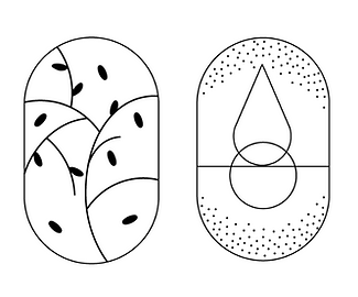
The mark logos will be utilized for various hotel amenities, such as towels and signage, as well as on the website, restaurant menus, and in promotional materials. This mark logo will provide a consistent and recognizable representation of the Terra Sonoma brand across all touchpoints.


